The Harsh Reality: Most Fitness Websites Are Forgettable
Let’s be honest—most fitness websites aren’t exactly memorable.
They’re either drowning in clichés (cue the stock image of someone lifting weights) or cluttered with way too much information, making it impossible for visitors to find what they actually need.
Your website isn’t just a digital business card.
It’s your 24/7 marketing machine—a platform that attracts, engages, and converts potential clients. But if your fitness website design doesn’t follow fundamental principles of usability and persuasion, all you’re doing is giving people an excuse to leave.
So how do you build a fitness site design that makes people stick around—and better yet, take action?
These simple but powerful design principles will show you how.
1. Prioritize Clarity Over Flashiness

A sleek design is great, but clarity trumps everything. Your visitors should understand what you do within seconds of landing on your homepage.
What This Means:
- Headline First: Your core message should be bold and unmistakable. Example: “Custom Training Programs for Strength & Longevity” is better than “Welcome to My Fitness Site.”
- Simple Navigation: Every page should be accessible within three clicks or less.
- No Unnecessary Distractions: If it doesn’t serve a purpose, get rid of it.
Your site isn’t a museum piece—it’s a functional tool designed to drive results.
2. Build for Mobile First
More than half of your visitors will check out your site from their phones. If your fitness website design is clunky on mobile, you’re immediately losing potential clients.
Essentials for Mobile Optimization:
- Thumb-Friendly Navigation: No tiny buttons or hard-to-click links.
- Fast Load Times: Compress images, optimize code, and keep animations minimal.
- Minimalist Layout: Mobile screens are small—prioritize essential content.
If your site doesn’t work flawlessly on a phone, it doesn’t work. Period.
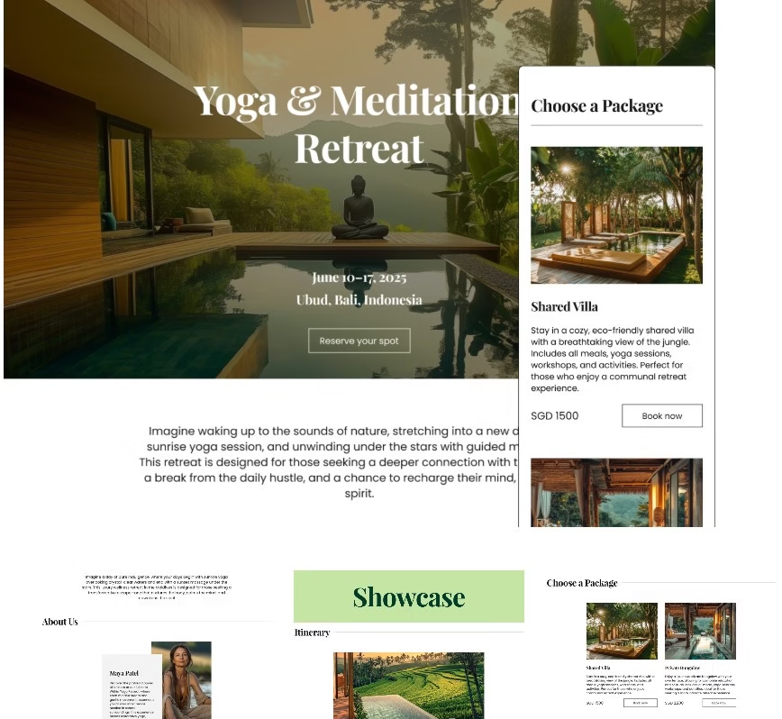
Getting it right, however, isn’t always straightforward—especially when you’re juggling client sessions, content planning, and admin. That’s where TheFlowOps mobile-optimised website templates come in.
Designed specifically for fitness and wellness professionals, they’re built to load fast, look stunning, and convert beautifully on any screen.
No guesswork. No tech headaches. Just mobile-ready websites that actually work.
Bonus: You’ll save 30+ hours of DIY trial and error.
3. Use High-Quality, Authentic Visuals
Stock photos don’t build trust. People want to see you, your coaching style, and real client results.
What Works Best:
- Personalized Images: Real photos of you training clients or demonstrating exercises.
- Consistent Branding: Stick to 2-3 colors and a cohesive visual style.
- Engaging Media: Short, high-quality videos > long, text-heavy explanations.
In a world full of generic coaching web design, authenticity is your secret weapon.
4. Optimise Every Page for Conversion (Because Friction Kills)
Here’s the hard truth: even the best product or service will be ignored if your website makes people work too hard to take action. In fact, research shows that every extra step in the user journey can lower conversions by up to 20% (HubSpot). Long load times? Confusing navigation? A cluttered booking form? These are silent killers—and most of your visitors won’t stick around long enough to tell you what went wrong.
Every page of your fitness website should feel like a well-oiled landing page: clear, persuasive, and designed to move visitors forward.
Here’s what a high-converting experience looks like:
- One Clear CTA Per Page: Whether it’s “Book Now” or “Download Your Free Guide,” make the next step obvious.
- Fast, Mobile-Ready Scheduling Tools: Integrate platforms like Calendly or embed direct booking forms so clients can lock in a session in under 30 seconds.
- Instant Access to Key Info: Pricing, packages, contact details—they shouldn’t be buried three clicks deep.
Still using a DIY site that leaves visitors guessing? You might be losing clients before they even meet you.
That’s why TheFlowOps website templates are purpose-built to convert. Unlike generic designs, ours are tailored for fitness and wellness pros—with conversion-focused layouts, built-in CTAs, and mobile-first functionality.

Explore templates that save 30+ hours of design work →
5. Build Trust with Social Proof & Credibility Cues
You could have the most beautiful website in the world—but without trust signals, visitors won’t convert. In a saturated fitness and wellness space, what people say about you often matters more than what you say about yourself.
Social proof bridges the gap between curiosity and commitment. It reassures potential clients that they’re in capable, credible hands—and it works. According to Nielsen, 92% of people trust recommendations from others, even if they don’t know them personally.
Here’s how to weave trust into your site design, strategically:
Where to Place Social Proof for Maximum Impact:
- Embed real client testimonials near every booking or “Join Now” button
→ Aim for 1–2 lines of praise with a name, photo, and what program they joined. - Add Google reviews or Facebook ratings directly onto your homepage
→ Use widgets or plugins that show updated reviews in real time. - Use before-and-after photos with short captions to show actual progress
→ Especially powerful on program or transformation offer pages. - Show star ratings (e.g. 4.9/5 ⭐️) above your call-to-action buttons
→ This adds a “quick glance” trust cue for users who skim. - Feature certifications clearly, either in your hero section or footer
→ Bonus: link them to the certifying body for instant credibility. - Include logos of media features or brand collaborations
→ “As seen on” strips are simple but powerful.
Using TheFlowOps templates?

Every layout includes built-in testimonial blocks and plug-and-play sections for reviews, badges, and credentials—so you don’t have to design them from scratch.
Explore done-for-you designs that help you sell through trust →
6. Build Trust with a Professional, Consistent Design
Let’s face it—most people don’t read websites. They skim.
If your site feels like an obligation to get through, you’ll lose potential clients before they even process what you offer.
How to Make It Effortless:
- Break Up Text: Use bullet points, short paragraphs, and bold highlights.
- Logical Flow: Information should be arranged in the exact order someone would look for it.
- Predictable Navigation: No one should have to guess where to find your services, pricing, or contact info.
Your website should feel intuitive—not like a homework assignment.
The Bottom Line: Function Over Flash
The best coaching web design isn’t about having the trendiest layout or the flashiest animations. It’s about creating an experience that makes it easy for visitors to trust you, understand your value, and take action.
To recap:
- Be Clear, Not Clever – Say exactly what you offer and make it easy to navigate.
- Optimize for Mobile – If your site isn’t mobile-friendly, you’re losing business.
- Use Authentic Media – Ditch stock photos in favor of real content.
- Guide Users Toward Action – Every page should lead to a clear next step.
- Build Trust Through Social Proof – Show credentials, testimonials, and real results.
- Make It Effortless – People shouldn’t have to work hard to absorb your content.
At the end of the day, a high-impact fitness website isn’t about impressing designers—it’s about converting visitors into loyal clients.
So, ditch the clutter, sharpen your message, and make every design choice intentional.
If your website isn’t making it easy for potential clients to say yes, it’s time for a change.
For a deeper dive into what actually gets visitors to take action, check out our guide on fitness trainer websites that convert—we break down the 5 key elements that turn clicks into clients.
Need a smarter way to create a high-impact coaching web design without the headache? TheFlowOps makes it simple. Head to TheFlowOps.com and build a fitness website that actually delivers results.